Mastering Presentations and Demos for Your Team
Learn how to create and deliver presentations and demos that engage and impress your teammates, boosting collaboration in tech.
One of the biggest benefits I’ve experienced from writing on LinkedIn and this newsletter is learning skills I never would have.
I’m able to notice frameworks everywhere.
Here’s an example from just today of my good friend Alex from Taro using one of the best frameworks for copywriting and presentations.
It’s called Problem-Agitate-Solution.
I used the same framework in my previous sponsored post to get the best results. See if you can spot each section here.
I’ve always gotten really positive feedback from the presentations I’ve given (but I’m certainly not perfect).
It turns out—the positive feedback was because I was accidentally using these frameworks along with a few other tricks I’ve picked up over the years.
⭐️ Main takeaways
Know how to give presentations that “wow” your teammates.
Two frameworks to structure your presentations so you never blank out at the empty slide deck.
📄 My credentials
Before diving in, I think it’s important to know the experience I’m sharing from.
I’m not doing this to brag (maybe just a little 😛)—only so you can make an informed decision about whether my advice might be applicable to you.
~5 company & engineering all-hands presentations (100-200 people)
~20 tech talks explaining a topic or decision (10-30 engineers)
~30 tech spec reviews (5-15 engineers)
Alright, you may have less or more experience than me, and that’s okay.
This is what I’ve learned and what has worked for me. Let’s jump into it!
⚠️ Disclaimer
This will appear longer than normal, but it’s because I included a lot of images. It’s actually brief.
💡 High-level principles and pitfalls
Word vomiting
By far, the biggest pitfall is “word vomiting” 🤮 slides. These are slides that look like this:
The level of wordiness is on a spectrum. It may be worse or slightly better than this.
We’re going to fix this slide step-by-step to show you each positive principle applied.
Rule of 3
If you give more than 3 points, your argument becomes less powerful. This is true from a psychological perspective. So pick the top 3 points and stick with those.
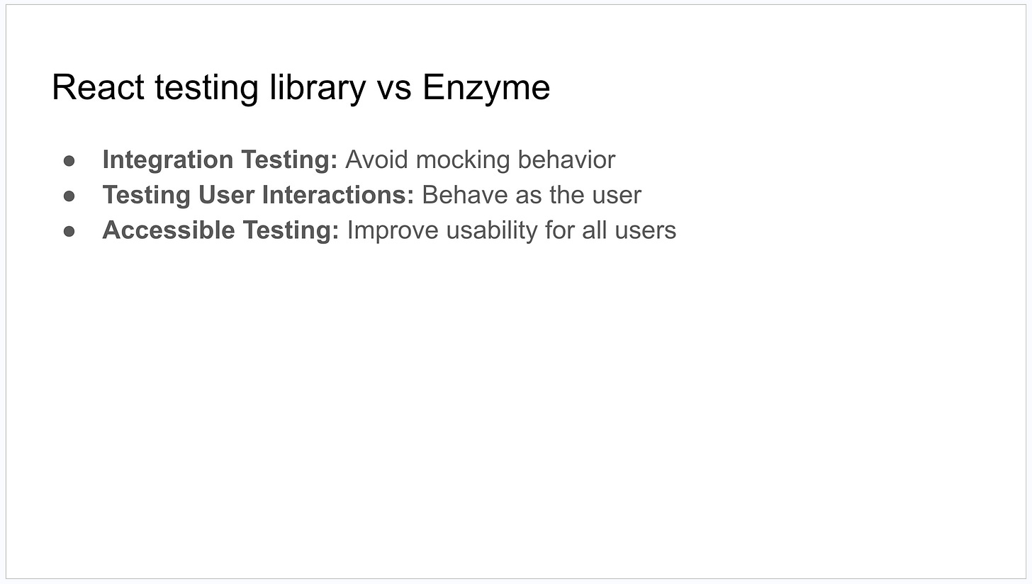
Here’s the slide with just 3 points:
Concise
The words you speak matter much more than what’s on the slide.
Every single word on the slide needs to be adding value.
The slide seems brief, but bear with me. The next step will help with this.
Ample whitespace
Add whitespace until it seems like it’s too much.
All I did was add a single line of whitespace between each bullet.
Show > tell
A ratio of 60% image slides to 40% word slides has worked best for me. I’m not saying it’s the best way, but I think it’s generally refreshing for people.
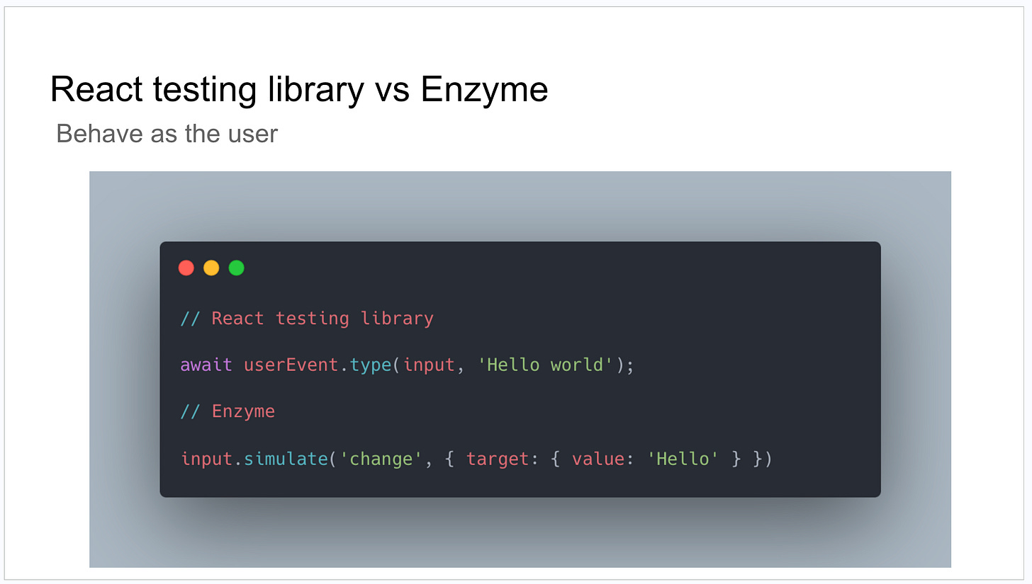
In practice, this is usually screenshots of a webpage, my terminal, or a block of code (generated through carbon.now.sh).
I usually split each sub-point into its own slide and explain it through an image.
Here, I’d explain how what React testing library does is simulate each keyboard event of the user, whereas Enzyme is only simulating a single change event on the input. This leads to brittle tests that don’t emulate user behavior.
Avoid overpolishing
This probably depends on your team’s environment and culture.
For me, you can see the slide images above are pretty basic. And I think that’s perfectly ok. For engineering presentations, content and energy matter most.
The only time I’ve applied a bit more polish is for all-hands presentations where there are many more non-engineering stakeholders.
Presentation structure
Here is where you want to use frameworks.
Two that work great for engineering presentations are:
Problem-Agitate-Solution
Problem: Concisely describe the problem
Agitate: Expand on it, make your audience feel the pain
Solution: Provide the solution
Before-After-Bridge
Before: The current state of the system
After: What the system could look like
Bridge: What the path is to get there
Problem-Agitate-Solution
Problem-Agitate-Solution is great for persuasion. You can use it to convince your team to adopt a new pattern or change a team process.
In the past, I’ve used this to explain the importance of using a performance dashboard to track the load time of pages across our app. I “agitated” by including a live demo of an existing long-loading page in my presentation.
The live demo helped my audience “feel the pain” of the problem and realize the importance of using the performance dashboard.
Before-After-Bridge
Before-After-Bridge is great for stories after having made a change—like a tech talk, all-hands presentation, or advocating for a migration.
In the past, I used this for a tech talk explaining how we previously handled GraphQL errors vs how we can handle them now with a new abstraction that solves a lot of our problems. The bridge was the story of how we came up with the solution and why.
📖 General tips and TL;DR
Always. Always. Explain the current state of the system. That’s one of the primary reasons both of these frameworks work so well.
The two most important parts of the presentation are the beginning and end. Always end with the main takeaways, path forward, or summary.
Keep slides concise, use the rule of three, and show instead of tell.
As always, thank you for reading.
- Jordan
P.S. You can reply to this email; it will get to me, and I will read it even if I can’t always reply in a timely manner.
Did you find this issue valuable? If so, there are two ways you can help:
You can also hit the like ❤️ button at the bottom of this email to help support me. It really helps!


I like the idea of Before-After-Bridge. As a platform team lead, I do presentations quite frequently. Will use this recommendation! Thanks!
Great article! I fully agree with the point that cluttering the slides with excessive text makes them hard to follow. The audience gets confused whether to concentrate on the text or the speech.
However, an argument I often hear is that text-heavy presentations are beneficial because they allow for easy review of the slides after the presentation especially for those that were absent.
Do any thoughts on that?